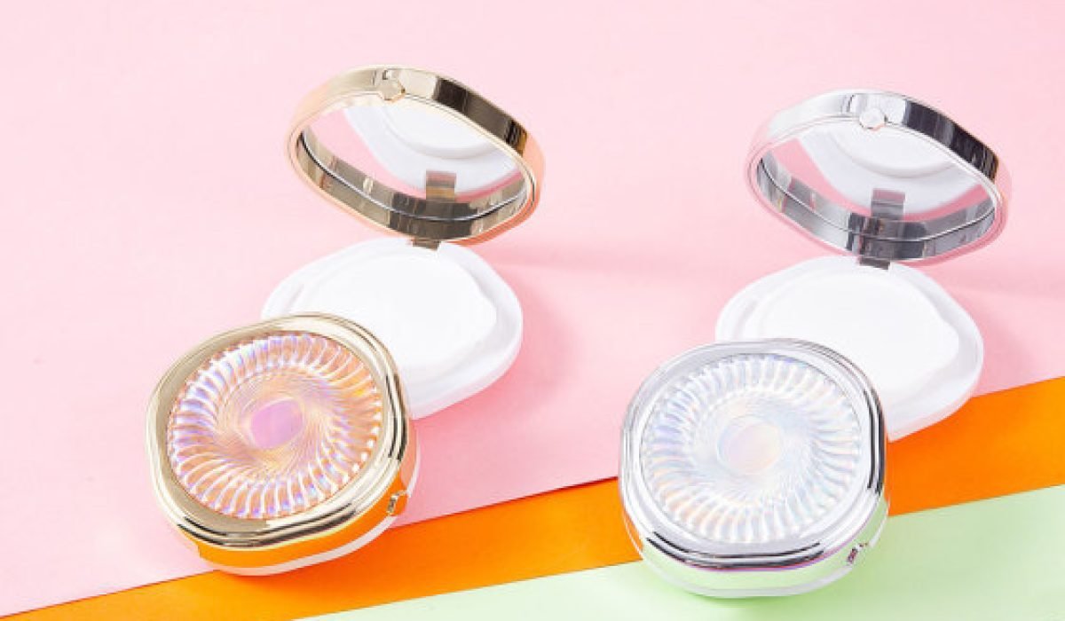
The main consumer force in the cosmetics industry is female users, and the use of color to reflect the sense of luxury is a key point in cosmetics packaging design. So what are the specific strategies for cosmetic packaging design?
I. Typography of brand text
The brand text of cosmetics generally needs to be designed to be more delicate, generous and concise. For example, the main refreshing facial cleanser packaging generally uses a thinner font on the text, which is enlarged behind the font to overlap the shadow; or the font itself is combined with the water element.
II. The choice of color
The choice of color should not only consider the characteristics of the cosmetic itself, but also the appropriate crowd.
For example, women’s cosmetics can be soft, voluptuous and passionate in color. In order not to lose the luxury of the brand, the use of color should focus on the sense of stability and not too jumpy. Teenagers use cosmetics can be pure and romantic, the style can also be more lively; children’s skin care products are more likely to use bright yellow, green and other colors that look healthy and intimate; men’s cosmetics are more in line with men’s aesthetics, most of the use of blue and black, and with the current increase in men’s awareness of skincare, the packaging design is also more inclined to the warmth and enthusiasm of the colors, such as orange and red.
III. The use of image elements
For younger cosmetic packaging design, we often use some illustration design, but we should pay attention to the fact that the illustration should not be too complex and dominant. For high-end people, illustration design is inevitably a bit childish, so we often use some graphic elements, in order to reflect the original and natural concept of cosmetics itself, but also often add some leaves, water, clouds and other natural elements to reflect.
Four. Cosmetic packaging container selection
In order to make the packaging novel and unique, the choice of container is also a key point to consider in cosmetic packaging design. For example, a cube gives a sense of stability and maturity, a cylinder will be more beautiful and bright, while a cone can give a sense of stability, firmness and a sense of elegance and nobility. As everyone’s aesthetics tends to be diversified and fashionable, sometimes we also use some special shapes of bottles, and if properly designed, this kind of cosmetic products will leave a deeper impression on people. However, it should be noted that, in addition to considering the aesthetics of this kind of shaped packaging, we should also consider whether we can pour out all the cosmetics in the bottle, otherwise the practicality will be greatly reduced.

